Quicklinks 2: How to Build the Renovated Version
Landing pages are bread and butter for all kinds of things, but what about Quicklinks pages? They help people find things quick and easy and get on their way.

Technical Blather
I finally took some time to renovate the Quicklinks pages used by myself and Dr. J. The goal was to make it easier on visitors to glance, tap, and go. The social media buttons have been moved to the top in icon format. Instead of paying LinkTree or MilkShake or some other platform to build your Quicklinks page, you can host it right on your own domain with a little bit of work. And it’ll match your branding!

Just as a reminder, I am using the Free Version of Nimble Builder to create this page. Your options may vary when it comes to modules and so forth.
If you built a Quicklinks page based on the first tutorial, then you’ll remember we did this the quick and easy design/copy/change text and url method.
Murder the Buttons… I mean… Uh, just keep reading.
In your Content Picker, choose or search for the Social Profiles module, then drag it into your workspace. It starts out with the main three social media sites – Facebook, Twitter, and Instagram.
We are going to start by killing… I mean deleting two of the three buttons. It’s easier, trust me. It doesn’t matter which two, just click that handy dandy trash can button for two of them, then click the pencil to edit the victor… I mean, remaining button.
Design Time is Fun Time
Now, we’re going to do all the things to this button until it uses a safe word… I mean, until it’s pretty and matches our branding colors.
Obviously, these are icon buttons, so we will be using the drop-down menu labeled “Select an Icon” to pick. There is a search option to make it easier. Just type in Twitter or Facebook. Sorry, there’s no option for ‘FetLife.’ Maybe another day.
This is a great time to open all of your social media profile pages that you want to include in your Social Bar.
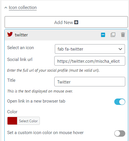
We’re starting with Twitter. So, type Twitter into the search box and pick the icon you want to use. Some have two icons, others you only get the one choice.
Paste in the url to your profile.
Type the name of the social media into the Title box – this is helpful for people who use accessibility features.
You do want this link to open into a new tab, so click that button.
Then choose the color the button will be. Do you know the HEX Codes for your Branding Colors? Now is a great time to find out. You want things to match for a reason. If you’re unsure, you can always upload your header image to the Adobe Color Labs and get the codes.
If you want your buttons to change color when someone hovers over them with a mouse, then turn that feature on and put it in. If you look at my home page, you’ll see that the menu links at the top change from gray to white when hovered over. While I didn’t set a hover color here, the buttons are using a hover color from somewhere in my sitewide settings.
Design Options: A Primer
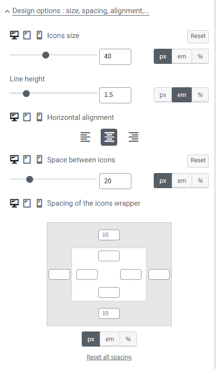
Let’s open the Design Options tab, take a drink, and crack our knuckles.
You know how these builders are called “What You See Is What You Get” aka “WYSIWYG” (WhizeeWig)? This is what they mean by it. You can see and alter the design as you go.
Saving a Draft and copying the link into a new browser while you work is a great way to see how you’re doing when it comes to spacing, colors, etc. Don’t overthink it. WYSIWYG has been around a very long time and it’s come a very long way.
Tap the Gear in the Customize Menu, then choose “Save Draft.” The Publish button will change to Save Draft. Click it to get a temporary url to preview the page. Click the “Copy” button and then paste into a new tab.
Anyone can do it with enough alcohol… I mean patience and breathing. Even me. Who prefers coding. The latest versions of these builders means you just have to fiddle around with it enough to get a page or website to look good on all three device types and BAM, you’re a web designer. I know, so cool, right?
Remember, the icons are for Desktop/Laptop, Tablet, and Mobile. You will need to design for all three options. The one shown here is for Desktop/Laptop.
Technically, for me, it’s the same for all three. I purposely made my icons large enough to collapse into two rows when on mobile that look nice and neat and properly spaced for easy tapping.
You’ll fiddle and fix this once we have all the buttons under our thumb. I mean, completed. For now, pick something large enough to work with, or just set the same options I have here and you can decide later.
Copy/Paste/Copy/Paste
Now comes the quick and easy bit. Go back to the Icon Collection Menu and choose the double-square icon. Click this button until you have the number of social media links you plan to share in your Social Bar. Then click the pencil icon on each one to choose the Social Icon and paste the url into the box. Do this for each and every profile. Remember to change the Title Text for each one as well. Do it now. Do it good. Click that button just like you should… Oh sorry.
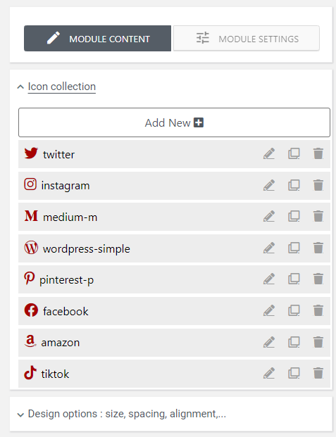
Anyway. You can see that I’ve included Twitter, Instagram, Medium (which has an old icon, not the new fancy-schmancy three slanted slashes icon they switched to a few months back. I’ve no idea how to update that.), WordPress (which, obviously, goes to my home page), Pinterest, Facebook, Amazon, and (for funsies, even though I don’t post there) TikTok.
After you’ve edited each button to its appropriate details, feel free to click and drag them up and down to appear in the order you want them. I have Twitter first because that’s where I’m at 99% of the time. I use TikTok but I don’t post there, so it’s last.
Once you’ve edited all your button details, go back to the Design Options Menu to make sure your margins, padding, and chosen size all work for Desktop/Laptop, Tablet, and Mobile views.
Then, if you created the normal buttons from the previous tutorial for social media, go through them and delete those buttons and any extra spacer sections.
NOTE: If you want to have your buttons alternate in color for some reason, you can edit the details for two buttons, then do the copy/paste/update method, and put them in alternating color order.
Don’t be afraid to play! Just remember to save before doing something where the results may be sketchy.
If You Like It, Put a Border on It
To add a border, you’ll click on the green button for the column settings. This will pull up a new menu with all kinds of options. Select Border Settings for the module. Here, you choose the type of border you want. I chose solid. then you can choose the color, width, and roundness of the border. You can even choose which side has a border. Play with it to see what works for your style.
If you had a border previously on your buttons like I did, you want them to all match or they’ll look odd. Go through and make sure they all match. It will be noticeable if they don’t match. (Yes, I always wear matching socks, too.)

Extra, Extra!
This is also a great time to add things if you haven’t recently updated your button list. Were you interviewed on a podcast recently? Did you highlight that super cool awesome thing you saw or posted on YouTube?
If you look at Dr. J.’s Quicklinks page, each week we update the image and link for #TheSexualitySpace on Twitter so everyone who visits her QL can see what’s going on.
On mine, I included icons to be fun. The $ icon shows which items I receive affiliate money on.
I also included my disclaimer in my footer about those affiliate links just in case someone gets a little huffy.
Save and Drink – I mean Save Draft and Preview in Browser
I have probably saved and previewed this post 50 times while creating it because… WYSIWYG doesn’t mean 100% of what you see is what you’ll get. Spacing might be weird, headers might not go where I want them. A post is different from a page, but you still want to make sure you’re saving often in case of some kind of failure to communicate with the server.
While renovating Dr. J.’s Quicklinks page, something weird happened where the changes I was making were not saving or translating to the actual page. I had to discard all changes and start from scratch because I hadn’t saved often.
When you’re sure everything looks great in the browser, open your browser on your phone. I prefer Chrome everywhere, so that’s what I use. Publish the new Quicklinks Page, then immediately open it on your phone. Look at it as a whole. Does the design translate properly. I had to fiddle with a few things after I published because some items weren’t looking the way they should.
NOTE: If it still says ‘Save Draft’ on that button, click the Gear, choose Publish, then the button will change back to Publish.
Can you easily tap the buttons on your social bar? Are the words on your buttons breaking in odd spots? Go to the tutorial for the previous Quicklinks page design to see how to fix that. You want things to be easily scanned. People don’t have time for oddly broken lines of words.
Questions? Comments? Suggestions?
Did you try out this Quicklinks tutorial? If so, please let me know how you fared. Ask questions or make suggestions in the comments section so that I can give better direction, please.

