Quicklinks: How to build your own

Technical Blather
Quicklinks Page: Let’s Get Building!
If you have a self-hosted WordPress website then you’re probably using a theme that comes with a builder for pages, forms, and more.
I would rather you pay a fee to an individual (like say me) to make a Quicklinks page for you on your own website rather than pay a monthly fee to a platform to host one for you.
You’re already paying a hosting fee for your website, so paying any extra funds is throwing away money.
WordPress themes give you the tools. I will happily show you how to make it work.
Hueman and Nimble
I use the free version of the Hueman Theme by PressCustomizr. It comes with the Nimble builder as an add-on. While I have issues with WYSIWYG editors, they’ve gotten way better in the last decade.
You don’t have to be a coding genius (I am not) to make a page using an editor. You may need some patience and your preferred alcohol, though.
There are apps and platforms where you can build a quicklinks page. Some are free. Others charge a monthly fee. Not all offer customization to match your brand. It’s always best to match your brand if you can.
Let’s Get (Nimble) Building
Start a new page. (Admin Bar: New>Page or Side Bar: Page>New), don’t click Build with Nimble Builder (or whatever builder you’re using) just yet. I made this mistake several times before Googling.
SEO
Title your page. If you want to have a Featured Image, SEO, etc, do it here. You can do it later, but it’s easier if you do it now. Honestly, you should know what these things are prior to publishing a page or a post.
In the Post section change Public to Private. This is so you can quietly build the page without others stumbling upon your unfinished masterpiece.
- If you’re viewing the page, click Build with Nimble Builder in the Admin Toolbar.
- If you’re in the Pages menu, you may have to view the page, then choose this option.
- If the page is saved as a draft, then you may see the Build with Nimble Builder option after View.
- If you have a drink, this is where you enjoy some while it loads everything up.
This is where things get fun. See, your theme always includes a header, footer, and sidebar for the entire website. Today, we’re going to kill them for this page. 😈
I’m working from Nimble Builder settings. Your options may vary.
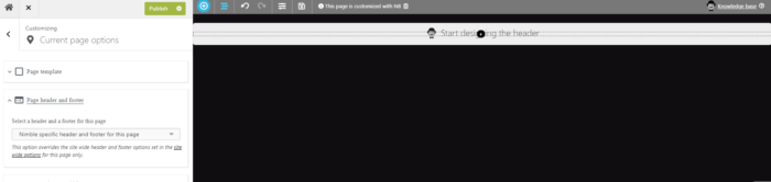
Under the Nimble Builder menu, you’ll see Current Page Options, Site wide Options, and Content Picker. First, go into Current Page Settings.
There, you’ll find Page Template and Page header and footer menus. Under Page Template, you want to choose Nimble Builder Template. Under Header and Footer, you want Nimble Specific for this page.
You’ll see a blank page, then. Unless you’ve tampered with the settings previously that is….
Now that we’ve murdered the theme, let’s rebuild from the bones!
Click the back arrow to start from the beginning, then go into Content Picker. I know, so exciting!
Once you’re in the Content Picker, if you’ve been using the Gutenberg editor, you’ll find familiar bits and bobs. Drag the Image block into the workspace if you want a header image. This could be the Featured Image you setup earlier. It could be something specific for this page. It’s your choice. You could even do a slider with the carousel.
I like a little space between my buttons, so grab the Spacer block and drag it into the workspace below the header image.
Then, drag a Button block below the spacer. Now, we work. When you add the button, the settings to the left should open that menu. If not, click on the button. (The button says Click Me, so…yeah.) Make the link text obvious. Follow Me On Instagram or Watch/Listen to my Interview on {Insert fabulous thing here}.
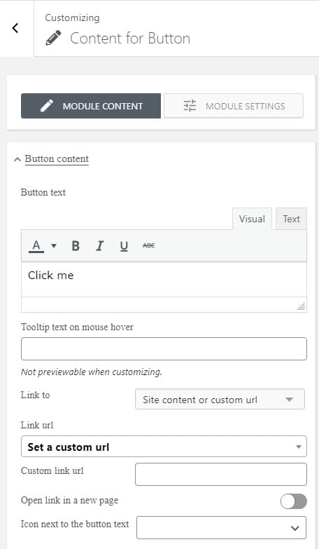
In the panel, you’ll edit your button text first. Since it’s a button, we want to change Link to: from ‘No Link‘ to ‘Site content or custom url.’
This adds Link url below it. Here is where you choose to Set a custom url or Search for a post in your website you want to link to. If you’re linking to a custom url, another box will appear to paste it into when you choose that option.
Since this is a page for Quicklinks, I recommend opening links in a new tab. You can turn that feature on by clicking the slider button. If you open the links in a new tab, the user can then return to your Quicklinks menu to choose another item. When you have multiple social media platforms, this makes it easy for them to follow you on all of them.
Below the new page option is a drop-down menu stating “Icon next to the button text.” I tested it for this post, but it appears to do nothing. There may be a bug or glitch I don’t know about.
Let’s Brand!
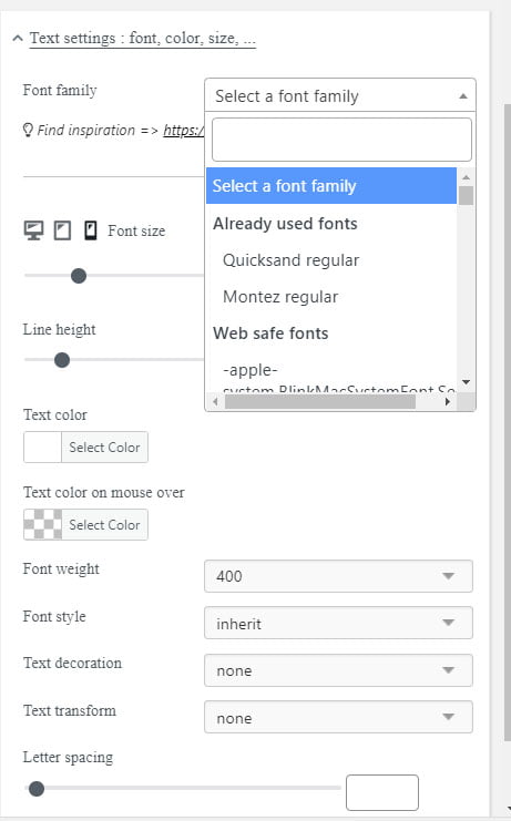
In the next two drop-down panels, you’ll choose your text and button colors, the size of the button, the roundness of the corners (if you choose to round them), and font, style, size, etc.
When you choose the button and button text color, this is where your branding comes in. You can match the colors of your website here. Clicking on the color box will open a dialog where you can use a color picker or insert the hash (ex. #000000 = black) for your preferred color. You can also use the same fonts you’re already using, they may even be listed under ‘Already used fonts’ which makes it easy.
Warning:
If you look at the screenshots I’ve provided, you’ll see three icons. One looks like a monitor, another looks like a tablet, the other looks like a phone. These represent Desktop/Laptop, Tablet, Mobile layout options and you can see how the page you’re creating will look on each one by clicking them.
You want to customize the width of your buttons for each layout type so it looks nice. You’ll want to make sure that your button text wraps properly for mobile, and if it doesn’t, go back to the text box and hit enter before the word that’s wrapped incorrectly to fix it.
Okay, I have my button, now what?
Once you’ve designed your button look the way you want, we copy it as many times as needed for the other buttons you’ll be creating. This saves you time because you don’t have to edit each button individually and try to remember all the settings. You’ll just change the text for each button, then verify that it works in all three view options.
This is also great if you want something to stand out – you can design the button differently to grab attention.
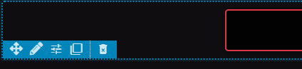
You’ll see two squares intertwined – this is the copy icon. Click and drag it down. Then rinse and repeat until you have all your buttons. Now, click each button to edit the description text and the URL.
Time for the Real Work
But, Mischa… they’re all shoved together! That’s okay if you want it that way. Like I stated previously, I like a little space between my buttons for a clean look. Go to the Spacer Block you inserted in between your header image and your first button (if you didn’t do this, that’s fine, too, grab the Spacer Block from the Content Picker and place it in between two buttons).
You can also edit the Spacer to a precise height if you wish. Once done, copy it and drag it between the other buttons. This is where more drinking happens. Give it time to load, it’s a lot of work for some reason.
Promotional Option
Once done with your Spacers, decide if you’ll have a footer and what you want in that footer. This is a great place for a promo image if you have things happening.
Save your draft and preview it in Desktop/Laptop, Tablet, and Mobile. Edit as needed. Once you’re satisfied with your results, save the draft, exit the builder, and go to your Pages list. Find the Page, click Quick Edit. If your page is a Draft, change it to Published and save. If it’s listed as Published, look to the left for the Private check box and uncheck it, then save.
This is my Quicklinks page so you can see how I created mine.